
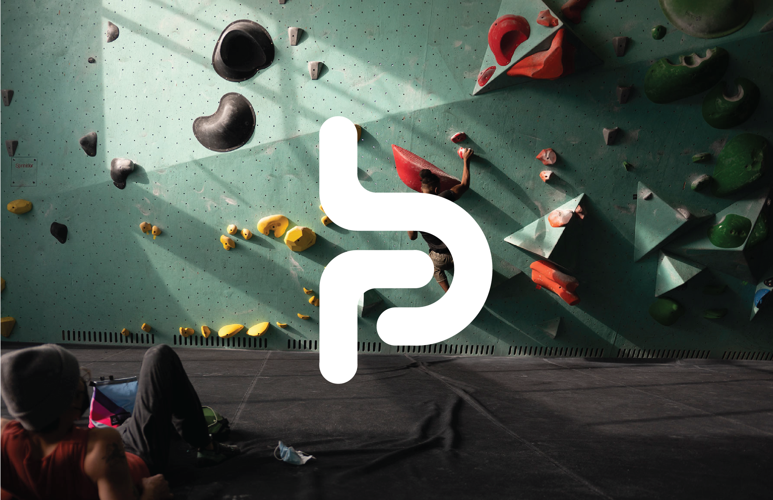
Bouldering Project Rebrand
BP had recently undergone a massive rebrand that universalizes its tone across its multiple locations and social media, but in the pursuit of universalization and modernity, BP had lost some of its quirk and charm that invited people to its original location in the first place.
The Challenge
The new brand identity reflects its roots as a lively, inclusive community space for all ages, and types of movement. I developed a modern design framework that blends vibrant colors, curated imagery, and inviting language to ensure a cohesive and engaging presence across different platforms.
The Solution
Roles & Duration
Roles
Art Direction, Branding, Layout, Illustration, Environmental
Duration
11 Weeks | Jan 2022 - Mar 2022
Tools
Photoshop, Figma, Illustrator, Indesign, Procreate, Notion
Research & Discovery
The process began with exploring the physical space and deep-diving into the story behind the Bouldering Project. As a multi-use recreational facility, what sets it apart is its variety of offerings, approachability, and community despite bouldering being a solo sport. With an understanding of its background, I worked through a series of visual brainstorming exercises using over 200 images to narrow in on the visual tone and voice of the brand. I focused on the aspect of growth mindset.

Concept
Working from the key brand characteristics, I narrowed down the growth mindset concept and created a tagline: Growth through play. I then refined a concept board to further inform direction, and chose elements carefully to represent different tonal aspects. Theres an emphasis on clean guiding lines, and energetic colors.

Deliverables & Iterations
logo
loyalty card
route wayfinding
social media posting
Each of these pieces helps drive home the specified concept and allows for Bouldering Project’s space and ideals to shine through.


